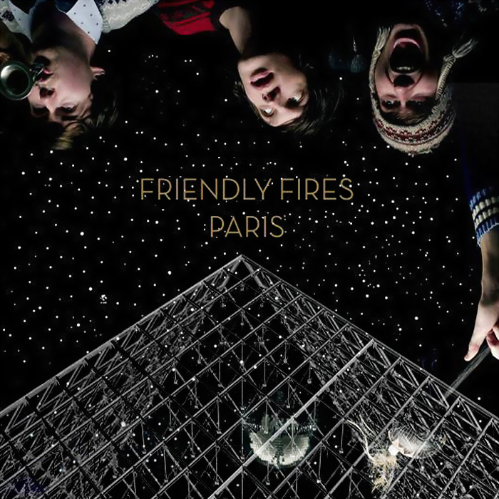
Search My Blog

Wednesday, 28 April 2010

The Finished Video, Advert and Digipak.


TA - DUM!!!!!!!!!!

Here are the final products.
I hope you enjoy learning about how I reached this point!


Advertisement - The Finished Product

I feel that this design:
*creates synergy between itself and the digipak
*shows what it is advertising well as the most important information is prioritised in size.
*is eye-catching as the center image draws the eye in, while the triangle that surrounds it points up to the most important part: the band and album name.
*includes all the information that was regarded as highly seeked/highly important in the survey-results.
*is effective when placed along side the digipak design and the music video as you can tell that there is a connection between them.
*is effective even though the imagery is different to the music video because the girls' legs with the roller skates still give the connotations of youth and fun.
*is effective as the reviews are all enticing as they are complimentary of the album and the group. They are quoted from Q, Alex Zane and NME which Indie music followers would recognise and value.
*is effective as the smaller copy at the bottom provides the other essential information that was considered less important in the survey-results.
*is effective as I referred to Marina & The Diamonds' advertisement, taking influence from the layout. This meant that my final result resembled a real media text.
*is effective as the imagery is interesting, which was important to the people surveyed for the digipak, and thus applies to this design. It would also attract the 78% of my target audience who preferred Marina & The Diamonds' jewel colour-scheme. 70% of the surveyed people said they'd find images of outer space more appealing, too.


Audience Feedback on Our Music Video


Today we thought it would be interesting to collect some audience feedback by filming a few of our target audience's reactions. After having watched the video - and in one case, whilst watching it - I asked the following questions:
  • Which genre would you put our music video under? - All of the people surveyed associated the video with the Indie genre.
  • What were the best and worst aspects? - The people we asked thought the best aspects were the editing style, the introduction with the overlay of the two pieces of footage, and the excited feeling they got from it. The worst parts were considered as the lighting and lack of dancing in some parts.
  • What was your overall view of the music video? - They said it was a really good video and they enjoyed watching it. They felt that it appealed to them especially as they were into Indie music.

Saturday, 10 April 2010

Conventions used in our music video

In order to adhere to the brief set for us in A2 media, it was vital that we used and conformed to the conventions from real media texts. Through the research of real media texts, such as films and music videos, we were able to complete the two briefs successfully.

Research

We have researched music videos such as The Kooks’ ‘Naïve’ and Metro Station’s ‘Control’. As our music video for ‘Happiness’ was a party scene, it was important that we broaden our perception of the conventions of such a scene. We did this by researching further into other types of media texts; watching the ‘Skins’ promotion and the house party scene in ‘American Pie’.


Costumes

Costumes for the production were carefully picked out and we used ellipses editing to remove anything that would hinder the representation we wanted to create. To give an example of this, we cut out takes of people who did not conform to the Indie representation. In general, the cast of our house-party style music video wore clothes that fit the Indie scene, i.e. cute dresses as opposed to the sexy dressed one would expect in an R&B video. The central protagonist was styled as an archetypal ‘Indie-Cindy’ of the moment: with a checked shirt, high-waist shorts, a crop top, long blonde hair. Additionally, there is a recent trend of wearing masks to parties (demonstrated in Metro Station’s video and also in the TV advertisement for Smirnoff) that we adhered to. We designed a bunny mask for her to wear as this would highlight the fact that she is the protagonist and would fit with the song’s title: ‘Look At That Rabbit Go!’. It was also important to reinforce the fact that the bunny (ie. Girl) was being chased by the fox (ie. Boy), and so included a male character adorning a fox mask.


Location

The location of the promotional music video was fitting to conventions of a young, indie party scene. It was obvious that we had to use a house as a set, to adhere to conventions shown in Metro Station and You and Me at Six’s videos ‘Control’ and ‘Kiss and Tell’. These two videos show familiar settings, like a living room, to hold the scene of a house-party. We took influence for the dim lighting from the promotional advertisement for ‘Skins’, but mainly from The Kooks’ video for ‘Naïve’. These media texts were researched via Youtube.com as well as via the television. This meant that we were adhering to conventions recognisable to a range of the Indie genre’s target audiences.


Gender Representation

Our approach towards gender representation in ‘Happiness’s video was influenced by real media texts. Our research showed that the female was more powerful in music videos, but still retained the use of the male gaze. An example of this is Little Boots’ ‘New in Town’. Thus, we have represented her as the central protagonist. She is young, fun-loving, in the male gaze and the centre of attention. This was represented through her costume and via camera and editing techniques.

Male Gaze

It is interesting to me how we have adopted the 'male-gaze' in our video despite the face that we are female music-video makers. The idea proposed by Laura Mulvey, in 1975,was that women in films were there for display purposes only as the filmmakers were predominantly male.
We have adopted the male gaze as we felt that it would attract male viewers to have a voyeuristic response to this 'display'.Although we as females feel objectified and passive because of the representation, we felt it necessary to adhere to this convention as it appeals to the male part of the target audience. We counter-acted this partly in ordered to attract the female audience. Nowadays, women are more powerful and independent, so we have included an element of this by not being explicit, not featuring sexual content, and by subtly representing men as lusting but not having.
This un-provocative, un-sexual representation of women is evident in real media texts from the Indie/Alternative genre: for example in Little Boots and Ellie Goulding's music videos.They are pretty and attractive but not slutty.

Note:-
Powerful independent female artists (like Madonna) have changed things by being sexually provocative and 'in control' of the sexualised gaze.

Music

Upbeat to fit the indie lifestyle and representation
*used Jamendo.com
Influences:

Editing

*Bloc Party = editing cuts
*Ellie Goulding = overlaying of two takes
*Influences: Bloc Party, Ellie Goulding

Sunday, 4 April 2010

Realising the effectiveness of the combination of the main and ancillary tasks.

Throughout the construction of my 3 media texts, it was important to consider the ways in which the combination of the music video, album art and advertisement were connected. This would therefore create strong synergy between both the products, furthermore it would ensure that my target audience is able to build a relationship with and a connection between the products when looking at the music video or the digipak.

How have you created synergy?

Creating synergy was very important to me in this project as I was keen to ensure that my target audience could make a connection between the three texts. If they could, this meant that the band would become well known and this would increase awareness and revenue.

I have created synergy by using the same iconography in all three texts. Using iconographies are helpful and easy to use if you want your audience to subliminally make links btween things.

The imagery and ideology that I repeated throughout my three texts were as follows: the girl with the bunny mask; the band and song title; the same outfit used for the protagonist, including the bunny mask; the idea of speed; the imagery of night (night-time in the promo video and the night sky in the ancillary texts).

Between the digipak design and the advertisement, I think there is especially strong evidence of synergy. Audience feedback reassured me that people would be able to recognise and find the digipak after having seen the advertisement's design.

Intertextuality was used in order for the consumer to be able to recognise the branding of the artist. Through this creative decision to reuse the iconographies the audience will feel as if they are growing a relationship with the artist (as she/he will be able to recall and recognise the artist). Our music video help intertextuality as the target audience would be able to realte it to an 'Indie' television show called 'Skins'. This show often has footage of party scenes and youth's rebellious behaviour.

What would you have done differently, but didn't do so as to please the target audience?
I would have thought that having imagery of the protagonist from the music video would be important for the consumer to be able to make the connection between the texts. However, the survey showed that the target audience were more interested in a design than seeing the real face of the artist. This is true to many real media texts' design in the Indie genre. For example, none of the following digipaks' covers feature the artist's face: The Foals, Friendly Fires; The Maccabees.
The research and planning process was vital to the production as I learnt the conventions of other real media texts which meant I could better shape mine by realising their conventions. Additionally, surveys helped shaped my knowledge of my target audience: their ideologies and preferences. Before all of this I would have thought that my target audience for the Indie genre would prefer a production without special effects and fast editing. However, I realised that these were features that would make my music video more effective. 100% of the surveyed people preferred Bloc Party's Helicopters' fast jump cuts to Coldplay's Strawberry Swings' stop animation from a fixed angle. The final outcome was effective as we have attracted our audience by using what they prefer; and from feedback we have learnt that it makes them feel a part of the scene and excited.


The Digipak

How did I make it?

Components of the Digipak:
- 2 images of the Universe from NASA.com
- 1 image of Legs with Roller-Skates from Flickr.com
- Photographs of The Female Protagonist (Rolerskating, Indie, Rabbit).
- Photographs of CD disc
- Elements of small print taken from The Futureheads' digipak
- Text
- Light ring for rim of CDs
- Polaroid from Google.com/Images
- Shape of a triangle (translucent)

I used Photoshop CS4 to create the digipak. I made use of many features: layers, blending options, opacity, etc. I organised my layers of components into groups in order to make the process quick and efficient. Research was important in the construction: I used Google, Flickr and Nasa's websites to source imagery that suited the design I envisioned for my digipak.


Components of the Digipak:

- Images of the Universe from NASA.com
BECAUSE:- Stars and imagery of outer space if often used in real media texts for the indie/alternative genre.

- 1 image of Legs with Roller-Skates from Flickr.com
BECAUSE:- In order to create a connection with the youth ideology of 'Live Fast, Die Young', which the album's title reinforces: 'Look at that rabbit go!'

- Photographs of The Female Protagonist (The roller-skating, indie rabbit girl).
BECAUSE:-

- Photographs of CD disc
BECAUSE:- To create an authentic look to my digipak design

- Elements of small print taken from The Futureheads' digipak
BECAUSE:- To create an authentic look to my digipak design

- Text
BECAUSE:- To provide information about the product to the consumer.

- Light ring for rim of CDs
BECAUSE:- To create an authentic look to my digipak design

- Polaroid from Google.com/Images
BECAUSE:- This attracts the target audience, whose ideology is to favour vintage items.

- Shape of a triangle (translucent)
BECAUSE:- This creates a feeling of being an elite group: The Indie Group. Those who are fans or followers will recognise this icon which is a signifier of the Indie genre.

Saturday, 3 April 2010

Final Image of Digipak & Audience Feedback


How I distributed the survey and what I hoped to gain from audience feedback.

To gain audience feedback on the digipak, I have posted my work on social networking site 'Facebook' in order for friends to view it so that they could be surveyed on it. I used Surveymonkey.com to design my survey, and collected and analysed the results via this. The link I gave via Facebook was http://www.surveymonkey.com/s/L6V87CV.

After posting the digipak album cover onto the social networking site I have was able to learn and consider the constructive criticism from an audience's perspective. Furthermore, this allowed me to consider different ways in which I could improve the second ancillary task of creating and advertisement.


AUDIENCE FEEDBACK


I constructed a survey using www.surveymonkey.com.
I created a link to the survey and sent it to friends via www.facebook.com.

I asked 10 people open and closed questions to see how they reacted to and absorbed the information given by my digipak design. The results will tell me if there's anything I need to improve on: and the results are positive!!! Every aspect was positive except from the fact that people picked up on how I did not have a variety of fonts. This is fine though as it was intended, and as long as the text is legible (which 100% of people say it is) then that's what matters to me. It was intended as the imagery used is quite complex - legs, polaroids, the universe, etc - and my creative decision was to ensure that the text was not also complex. As the results shows, this has proved effective.

THE RESULTS

100.0% could state the name of the band and the album.
This information is a vital part of the design of the digipak. I had to ensure that people could recognise what the product's content was.

100.0% assumes that the design adhered to the Indie genres' conventions.
It was vital to the success of my product that the design adhered to the conventions. I had to ensure that the target audience would be interested in it and recognise that they would like the music as it is 'Indie'.
100.0% agreed that the text was legible.
It's important for me that the audience to identify the song, band and album names, etc.

70.0% agreed that there was a variety of font and text sizes.
(The 30.0% who did not agree stated: "yes to sizes, there's only a couple of fonts"....sizes yes, fonts not really").
It's important that the audience can identify the important information presented to them (ie. smaller text used for the Small Print, and large text for the important band name and album name).

100.0% thought that the variety of font and text sizes suited to the design.


100.0% agreed that there is an approriate integration of illustration and text.
A previous survey showed that my target audience appreciate good design.

100.0% thought that there is an accurate use of language and register.
Accuracy shows professionalism and legibilty.
100.0% agreed that my design shows that I have an understanding of the conventions of layout and page design.
It was important that my audience recognised the design as being a digipak.


IMAGES OF RESPONSE SUMMARY FROM WWW.SURVEYMONKEY.COM


Advertisement - Stages of Development


Improvements to the digipak design

In order to conform to the expectations of the target audience, I have improved my digipak design further. From recent research, I found that a convention of the alternative/indie genre's marketing was to include a symbol that the audience could recognise. This symbol was indeed, a triangle.

As I have shown here, there is now evidence of faint triangular shapes in the design.


1) I have added this triangle on the front cover. This will be the first thing the customer will see, and so I thought it would be very important for the symbolism to be included here. Even though I have filled the entire cover with it, it it not overpowering in the composition as I have lowered the opacity of the shape.
2) This image shows the digipak as a whole. This one demonstrates the importance of the triangle in the design of the front cover. I have left it out, to compare with the one above. I think it look lacking without it.

The two CDs have also had faint triangles introduced to their design at this stage.

3) This image just shows you all the layers and groups I have used in Photoshop to organise my production.
I organised them as following:

Cover Left

Cover Right

Middle

CD Left

CD Right

Background
4) This image illustrates a stage of my construction in photoshop. Here I was adding a Shape Layer. I lowered the opacity and made the layer an Overlay. The white edge around is just a selection in Photoshop and is not a creative decision.

OTHER ADJUSTMENTS
I brightened the text of 'Look at that rabbit go!' on the front cover. This was to ensure legibility after getting friends to proof read my digipak.


Saturday, 20 March 2010

Survey Results for the Advertisement


I advertised my survey on facebook via http://www.surveymonkey.com/s/HWRHFJ9

RESULTS OF THE SURVEY ON THE PREFERENCES ABOUT ADVERTS.

1. Image + Essentiel information which is neither minimal nor over complicated is the preferred type with 63% agreeing.
2. 77% prefer the colourful jewel colours like Marina & The Diamonds’ advertisement.
3. 82% thought that they find it easier to find the digipak in the store if the advertisement’s imagery reflected the digipak’s.
4. 93% of people notice more music advertisements in magazines.
5. 100% prefer sans-serif fonts.
6. The most important information, and most seeked, were which formats were available, the review of the album, the release date and content of the product.
7. Imagery of outer space appealed the most to my target audience.
8. 78% didn’t care if they saw the protagonist’s face.

I will bear all of this in mind when designing the advertisement. I aim to please the target audience.

Wednesday, 17 March 2010

research into patterns in album cover designs

I have noticed that the triangle is a typical convention of indie/alternative music.
I have noticed the use of this shape in music videos, but mainly in the use of digipak cover designs. I have included images, which I found from the iTunes Store, of these below. Also, I have searched the internet to see if anyone else has noticed this convention. I have found a few possible answers as to why it is so popular, but they are just opinion based. See these below as well!

I will definitely be adding triangles to the design of my digipak - and thus my advert.


__Research from Yahoo.com__

Question: Why do indie kids associate with triangles?
why is it now days all you see are kids with triangles, is it the new edge instead of X's you draw triangles.. am i missing some trend?
e.g kids with triangles drawn on there bodies, tatoos of triangles, making triangles with there hands, photo's been photoshopped and triangles added.

so why do indie kids like triangles so much....?

thanks :)

Best Answer - Chosen by Voters
We prefer hipsters haha jk I have no clue what you're talking about really. But the triangle has always held a lot of symbolic meaning throughout time. It's a symbol for power and knowledge. True story.

Answer 2
Just like cars. I mean, in the 70's, round headlights were the way to go. The 80's come around, and nothing but rectangles. 90's brought rounded edges to rectangles. 00's brought in some weird angles, but were still mostly rectangular. Now they're jagged and crooked.
Society sees too much of something and gets tired of it(X's), so we move on to other things we haven't seen as much of(triangles).
It's a matter of boredom, really.

Answer 3
The triangle represents the up and downs of life. That sometimes life are not perfect and sometime is good. Its kinda like a ying yang in a way. Oh and is a cool shape too

Answer 4
its like a portal into space or something, because a lot of "indie" people say they love nature and stuff.

___Research from iTunes Store, on Digipaks with Triangles__


Friday, 5 March 2010

Representation in our music video

OUR FEMALE PROTAGONIST IS:-

*young, and therefore relates to the younger target audience
*in the majority of our music video
*represented as being self-confident
*represented as 'girly' via her costume (the rabbit mask that she wears is symbolic of her femininity, vulnerability - think innocent bunny rabbit - and sexualisation - think Playboy bunny )
*appears fun loving throughout
*an archetype of the female sex as she is shown as feminine; ie. concerned about appearance
attending a party

YOUTHFUL BEHAVIOUR:-
*rebelling and holding a non-adult party
*dancing
*singing
*being immature
*drinking recklessly
*wanting attention from the camera; and looking directly into it

PROFESSIONAL VIDEO:-
*added introductory titles appear giving the audience information about the Band and Song name.
*through lipsynching.
*through editing.


SEXUALITY:-
*hetrosexual (as the male fox is chasing the female bunny)
*the rabbit mask that is worn by the female gives the idea that she challenges patriarchy but at *the same time is a symbol of empowerment.


eye contact from crowd to invite the audiences gaze and make them feel included in the party.
central protagonists rarely make eye contact, focusing the audience’s attention on the surroundings. We attempted to show her as a independent and confident character.


SHOTS:-
*grainier, saturated effect.
*eye contact from crowd to invite the audiences gaze and make them feel included in the party.
*jerky documentary style camera work = voyeuristic feel that we used to create realism. *establishing shot of a suburban house followed by a mid shot of the party inside.

YOUTH IS REPRESENTED AS THE VIDEO:-
*is based around experiences that youth can relate to.
*shows a small group of people at a party who all wear similar 'indie' clothing, which links to the conformity in the younger culture.
*central protagonist in typically ‘indie’ clothing which also links to the idea of conformity.

'INDIE/ALTERNATIVE' FOLLOWERS:-
*via costume
*via the style of dancing
*via elipses editing because we didn't want to feature any footage of 'chavs' that came to the party.

GENDER:-
*male pursuing a female he is younger and seen as vulnerable.
*higher angle shot with and a title to show his youth, size and made our audience feel protective of him
*oxymoronic symbol of the fox mask worn by the younger less powerful character, as a fox is related to representions of strength and masculinity.

Use of Tech. in Construction, Research and Planning

Use of Technology in Construction
*Video Camera This was a vital part of creating the music video. It's portablilty enabled us to film anywhere with ease. It's handheld form gave us the ability to create the jolting camera movements that we wanted.
*At the same time, we could use the Tripod for added stability. Stable camera movements are often used in professional music videos, and so we used the tripod to incorporate these shots into our otherwise jerky shots.
*Lighting was
*iMovie was the software that we used to edit our footage. In order to create the final product, this was vital. It's features enabled us not only to edit and cut the footage, but adjust it's colouring, brightness, contrast, pace, repetition, and sound levels. Thus, we could experiment with these areas until we had created a video that used the conventions of a professional Alternative music video. To add a professional aesthetic, we added an introductory strip that introduced the band and the song name. This is a typical convention that one would normally expect to see on a music channel, like MTV2.
*Adobe Premier Pro was used only my myself. I decided that I wanted to use a more professional program for the editing of the beginning of the video. This professionalism, I hope, would attract the target audience. The features of this program let me edit the footage in ways that iMovie would never enable me to. I could *overlay two layers of footage [in the video, you can see how I have overlayed footage of myself applying makeup with another of myself dancing around in a bedroom mise-en-scene]; *adjust the lighting [I was able to create a flickering effect on the cheerleading section of the video for added interest]; and *add an effect to the footage to create a surreal, dreamy effect.
*Photoshop CS4 was used both in the construction of the digipak and the music video. In the music video, we used it to line up the cheerleading poses and insert this after the cheerleading footage was shown. This reinforced to the viewer that the word spelt was indeed 'PARTY'. The construction of the digipak was entirely thanks to Photoshop.


Use of Technology in Research
*Internet: Youtube.com This site let me view other established band's music videos. I particularly researched into the Alternative genre, of course. It was interesting to see people's comments and reactions to the videos. I think I will load my video onto Youtube to receive audience feedback, too.
*Internet: Google.com This site, of course enabled me to research everything from mask designs to album covers.
*Internet: HMV.com I used this to view album covers. However, it wasn;t very successful as you could not search by the Genre I needed.
*Internet: Music Magazines' sites, e.g. NME.com I used this to view how music advertisements are presented.
*Internet: Twitter.com I used this a little to research into band's Twitters, and see what kind of lifestyle they live.
*Internet: Myspace.com I used this to contact the band we are promoting. I was able to contact them to ask for the lyrics, and ask permission to use their uncopyrighted music.
*Internet: Jamendo.com I used this site because it enables you to search through uncopyrighted music, download it and use it. This is how I found the band Happiness, and their song Look At That Rabbit Go!
*Internet: SurveyMonkey.com I used this site for audience feedback. SurveyMonkey allows you create your survey online, distribute the link via Facebook.com, and create charts from the results. I thought it would be better to do it online as people are more accessible as they prefer to use computers; plus, it is more environmentally friendly.
*iTunes: iTunes' Store The iTunes Store was good for viewing album covers. I could search by the Alternative genre, too, which was very helpful. Also, you can view advertisements for Alternative bands.
*Television: Music Channels These channels allowed me, of course, to view other Alernative music videos. I mainly watched MTV2 as it shows more Alternative music.
*Radio: Radio 1 I listened to Radio 1 to listen out for bands that I could research in to. Radio 1 offers Indie/Alternative genre music, so this was good.
*Camera I used my camera to photograph different locations. This was helpful as we could make creative descions together easily without visiting the set. I also photographed items of clothing, so that I could confer with my group to decide which best suit the Indie image. I then wore these for the filming.


Use of Technology in Planning
*
Mobile phones: Texting/Calling This was vital for communication. We could plan dates, plan when and where to meet, plan who would be taking the equpiment home, plan who would be editting next.
*Internet: Facebook.com
This was also vital for communication. We could plan dates, plan when and where to meet, plan who would be taking the equpiment home, plan who would be editting next.
*Internet: Blogger.com This was used to plan, display and discuss ideas. Our group each Follow each others' blogs, so that we can see each others' ideas for the music video. It was good that we could meet in school, with our blogs up and discuss what every one had found and thus make group-creative-decisions.
*Microsoft Word This was good for when the Internet was not working. I could still write down my ideas and then copy, paste and post them later. It meant that my planning was not hindered due to any techinical problems.


Use of technology in Training
[2 days training with a company called 'CLC']
*GarageBand It was interesting to learn the basics of this program. Although, we did not end up making our own song. We opted for the more professional route of using Jamendo.com to promote the existing band, Happiness.
*iMovie We were taught how to mute the diegetic sound on our video and replace it with the non-diegetic sound of the band's song.


Effectiveness of the combination of music video and digipak

There is synergy between our music video and the digipak. This is primarily due to the fact that I have carried through the imagery of the protagonist into the design of the digipak. This ensures that the audience can make a link between the digipak and the music video promotion. The way that they will be able to make the connection and recognise the girl would create a feeling within the audience that they have a bond between the character and themselves. I have created synergy in the way that I intentionally chose the same costume for the girl to wear at the photoshoot for the digipak. The girl wears the same 'Indie' checked shirt, cropped top and the trademark Rabbit Mask. Additionally, I would like to note how I have subtley included the appearance of nightime in both media texts. The music video, being a party scene was set in the night time; and the digipak features images of a night sky. This night-sky imagery is a convention often used in new Indie media texts - for example in Little Boots' digipak, and Ellie Gouldings' music video for 'Starry Eyed'.

I wanted the album cover to be recognisable and memorable because this would attract the consumer. As you can imagine, in HMV, the store where we intend our album to be distributed - there are many other digipaks available and we wanted ours to stand out in the crowd. I think the way I purposely positioned the band's name at the top so that it'll be less likely that it would be covered by other CDs in the store. The bright jewel colours would stand out, too. To add to this, I had been interested in Pink Floyd's album cover which is iconic because of the triangle used on the front - I tried to emulate this in my own cover by using the shape subtley. This would make the audience remember the classic design and link it to my own.

I would have attempted to do this by creating a link between the album cover and the band's musci video. However, from the research that I did, I found that other real media texts did not hold much synergy between theirs. Therefore I followed this, especially as in a survey I held, 77% didn't care if the artist's face was included in the design. And so, I lowered the importance of showing our protagonist on the front cover - and instead used her on the back cover and on both discs.

Our target audience is the fans of the 'alernative' music genre. From my questionnaire I found that they preferred 66% preferred Indie album cover designs that did not feature the protagonist from the music video which is why there is no evidence of this is in my final outcome; and 67% were impressed by special effects because "it's more interesting than original footage" and "it's fun and exciting" which is why I used Adobe Premiere Pro with its extended features and Photoshop CS4 to create a special digipak cover.


I did an experiment with my friends. I showed them the digipak and the video on Monday and asked them today (Friday) to describe what they remember from each. We learned from this audience feedback that we has succeeded in creating a memorable identity for our band. This is because they remembered that:
*the protagonist was a girl in a bunny mask, whose image also featured on the digipak
*the video was of a party scene with young people as a cast.
*the video was shot as night time, and the digipak had an image of a night sky/universe
*the band and song name because they had linked the chorus with the digipak.
*a fun and vibrant mood was evident in both media.

Final Digipak Design

Sunday, 28 February 2010

Using, Developing and Challenging Conventions

Using forms and conventions of real media products:-

Our music video:
*Represents the youth of today, as we found many music videos did. (such as The Kook's Naive)
*By dressing our central protagonist in typically ‘indie’ clothing, synergy was created between our bands genre and our music video, which also links to the idea of conformity.
*We decided to choose a grainer, more saturated effect. This style reflects the ideologies of our target audience who are attracted by vintage products and whose lifestyle is fashionably grittier. The effect was also employed by The Cribs' music video for 'The Mirror Kissers'.


My digipak:
*I have used the conventions that I have noticed from other real media products, in terms of layout, page design, fonts, text size variation, use of language and integration of illustration and text.
*I have conformed to the loose convention and ideology that an arty illustration rules over the inclusion of the protagonist from the music video.
*I have ensured that the most important information is presented larger in the design. For example, in other real media texts such as Delphic's debut album where their band's name is very large on the front page compared to the 'small print' on the back. I did a survey to find out which information the target audience seeked most and ensured that this was the boldest.
*I have ensured that the format of the digipak conformed to the industry's format.
*I created a complex design which was common in real media texts for the Indie genre. This was evident in Little Boots' album called 'Hands' and in Friendly Fires' debut, too. When collecting information from the survey on digipak designs, these complex designs were rated highly.
*Through researching bands' linking album covers and music videos: I found that a convention was that the faces of the bands - nor the representation of them used in the video - weren't used in the design of the digipak. Often, an interesting illustration was used instead. Therefore there was not much synergy between the album covers and music videos in real media texts. Hence, there is not much in mine (however there is on the other 3 sides)

My advertisement:
*Uses the conventions that I had found were common in real media texts. The information provided was particular to music advertisements that I had found in magazines like NME, which my target audience would read.
*The information provided was presented in a similar way to real media texts: for example the text sizes used varied and so did the fonts that were used.
*Similar to other adverts I've seen, larger fonts were used to promote the most important parts of information.
*Imagery in the background was common, and so I used this convention too.
*When comparing real media texts of advertisements and digipaks, I noticed that there was a strong link between the imagery, text and fonts used. For example, Marina & The Diamond's album cover design was used in the advertisement.
*I used phrases like 'Out Now!' which were evident in others I had seen.

Developing forms and conventions of real media products:-

Our music video:
*I was initially planning on adding a translucent layer of flickering stars onto my music video, however, my trial for Adobe Premiere Pro had expired.
*We noticed that saturation was fashionable by the way that Indie followers are interested in vintage. We used iMovie to go through each clip to add this effect.
*We used a 'Romantic' effect that was a preset on iMovie to improve the lighting, as it was filmed in a party atmosphere.
*We experiemented with camera movements that reflected the Indie followers lifestyle - carefree and lively. We saw some evidence of this is The Kook's 'Naive', which is where we found the inspiration. It also invites the viewer to feel as if they are at the party as it mimic their movements.

My digipak:
*I wanted it to appeal to my target audience as much as possible, and so made a survey to see what they were attracted to in a design.
*After having noticed and researched into the convention of the use of triangles, I decided to develop my design to fit it. I added these triangles to act as symbol of the Indie culture which the target audience could recognise and relate to.


My advertisement:
*I developed my design for the advertisement in the way that other real media texts tend to use the same layout of imagery and text for both the digipak and the advertisement. I did not adhere to this convention as the survey I complied showed that 87% were interested in the design being a reflection, but not necessarily a copy. Therefore, my advertisement uses the same imagery but in a similar (not identical) layout. To me, this is more effective as if I had used the same layout, it would have looked silly considering an advert has a different shape to a digipak.


Challenging forms and conventions of real media products:-

Our music video:
*We adopted a voyeuristic feel that is not evident in many media texts. It is difficult to find music videos that use jerky camera work, but initially we were inspired by the camera movements in the Skins' promotional video. Our sometimes exaggerated camera movements were embraced in our production as we felt that they reflected the madness of the party scene; the state of a tipsy youth; and the stereotypically jerky dance movements that are associated with Indie music followers. Our style is much grittier and careless when compared to the conventions of the highly polished Hip Hop music videos. This 'gritty' and 'careless'ness would appeal to the target audience who is between 0-35 (but mainly 16-25, says the survey) and belong to the 'indie' stereotype. This stereotyped group is often un-materialistic, spontaneous and un-vain, unlike the stereotyped R&B follower. Also, our jerky documentary style camera work contributed to the voyeuristic feel that we used to create realism.
*The music videos tended to feature the band members either performing or as the protagonist however due to the fact we downloaded our music from a copyright free website we are unable to feature the band.
*As our budget is a lot less, our mise-en-scene won’t be as professional looking; and our lighting will not be either. This could be argued that it makes it seem more realistic.Other real media texts would use more professional programs for editing the footage, and better quality equipment that offers a professional aesthetic. We were mainly limited by iMovie's amateur features. However, I was able to use Adobe Premiere Pro to create the introduction, using a complimentary trial of the program. This meant that I could attempt to mimic the special effect used in Ellie Goulding's video 'Under The Sheets'.


My digipak:
*Does not challenge the forms and conventions in many ways, except one. This is that many Alternative/Indie digipaks are often covered in a cardboard sleeve. My digipak does not have this feature.
*I did not want to challenge the conventions as it was important to me that the audience could recognise and relate to my product.

My advertisement:
*My advertisement does not challenge the forms and conventions in any way.
*I did not want to challenge the conventions as it was important to me that the audience could recognise and relate to my product.

Friday, 26 February 2010

Basic Design


Spatiality


Symbols


People


Happening in the Background


Language


Fonts


Aesthetic Decision


Mood


Relationship between pictorial elements and wriiten material


Monday, 22 February 2010

Analysing a magazine advertisement for a band [Marina &The Diamonds]

CD COVER [LEFT]
MAGAZINE ADVERTISEMENT [LEFT]

SYNERGY AND INTERTEXTUALITY:
The same imagery etc is used for the digipak as in the advertisement. This is to create an identity for the band. It also ensure that the consumer knows what to look for in, say, HMV, when they want to purchase the product.


ANALYSIS

Basic Design
Triangular composition
No symmetry and no appararent reason for this

Spatiality
Filled spaced with graphic and copy elements
No use of white space, thus a messy, unclean look is given

Symbols
Open mouth = sexuality, sexual connotations
Jewel coloured vintage fabric = reflects the bands' name "Diamonds" and the albums' name "Jewels".

People
Facial expression = sexy (open mouth)
Position = laying down (implies sex)
Age = 20s (target audience)
Hair colour and style = brown (sultry) = loose (carefree)
Other people? = No, she is the only one (Implies she is main singer)

Happening in the Background
Head is superimposd onto vintage fabric
Sharp back and foreground
Vintage fabric = links to today's youth and their obsession with vintage objects.


Language
Simple Information
Short and Snappy
Different size fonts
- What it includes, when it is released, name of debut album and its release, how to purchase, formats available, quotes of reviews, website of band.

Fonts
Handwriting = carefree; implies lyrical notes; old fashiones which reflects 'The Family Jewels'
Sans-serif = Other side of youth (use of technology) (moderninity); smart and legible for information to be comprehendable.

Aesthetic Decision
Copy is arranged to follow the slope of Marina's photograph. The copy above her slants and the copy below her is horizontal - fitting around her face and body which lays central and horizontal in the composition.

Relationship between pictorial elements and wriiten material
The Family Jewels = Links into the colour scheme.

Attitudes
Economical and Social attitudes are perhaps portrayed.
Economical ===> An image of weath (The family Jewels and imagery of vintage fabric and old handwriting all evoke the idea of inheritance from a written will).
Social ====> An image of sex via her position and open mouth [and sex sells!]. The Family Jewels is also the youth's expression for testicles.

__________________________________________________________________

How will I take this into account when I design my advert and digipak?

I will:
* Ask the audience about whether they like it when there is synergy in the designs
* Ask the audience about whether they like the jewely colours
* Ask the audience about whether they like that you can see the 'face' of the band.
* Ask the audience about whether they like complex (Marina & The Diamonds') or simple (Field Music's) designs.
* Take all the aspects that I have analysed into consideration when I design mine.

Researching Features of a Music Magazine Advert

Our second ancillary task is to design a magazine advert for our band, and thus their digipak.
I have begun to research into some bands' magazine adverts and have picked out features that they include in order to publicise their digipak.


These are all possible information that can be included in magazine adverts for music:-


Name of Band/Artist
Merchandise that is available
Release Date
Content of product
Bonus material
Title of the album
Title of hit singles
A website link
Reviews
Record Label
Outlets where it can be purchased
Tour dates
In what formats it is available


I think I should pick a few of these - but not all, otherwise it would result in an information overload.

Analysis of My Own Digipak Design

EXPLANATION OF MY DIGIPAK DESIGN:-


IMAGERY:


Colour Scheme: Jewel colours give the appearance of quality and make the consumer want to look closer and admire the design. I chose to keep the image of the starry sky (and nebula) blue as it reminded me of The Empire of the Sun's album cover. The orange of the nebula creates interest.

Stars: This image is from Nasa.com. I was inspired by Little Boots' album cover to include this. These images of space are frequently used in 'indie' covers:- for example Friendly Fires and Empire of the Sun. To me, it illustrates to the consumer how their music will act as a means of escapism. Alternative music, to me, tries to be different and unique deliberately; the way space is seen as being so different to Earth is maybe a link into their own 'difference'.


Legs with Rollerskates:

  • The rollerskates are a symbol of fun, youth and the youth's need to speed through life. The target audience of Alternative music like ours would be a young group of people who may stick to the motto: Live Fast, Die Young.
  • The rollerskates also link into the idea of speed and thus the title of the album: Look At That Rabbit Go!
  • The positioning of the legs makes the girl they belong to look as if she is sitting on a cloud and dangling her legs happily. This evokes a happy image of her and thus links to the band's name Happiness. (I say that she looks like she's on a cloud only because of the rest of the design being of the sky).
'Rabbit' from the video sitting down: Used for synergy and continuity.


'Rabbit' from the video standing up: Used for synergy and continuity.


The fact that the images are starry: Reinforces the other-worldly-ness. It gives continuity to the design and 'pulls' it all together.


Polaroid picture with 'Rabbit' from the video sitting down: Polaroid photographs are linked to the youth and their current obsession with speedy results, creativity and vintage goods. Polaroids are 'cool' within the young Alternative consumer group. To reinforce this, you would not stereotype a RnB consumer to use a Polaroid camera!


FORMAT:

Sans-serif font: Conotes moderninity. Would appeal to the young target audience because of this. For instance, the target audience would not be attracted if the font was Times New Roman!

The fact that the font is starry: Reinforces the other-worldly-ness. It gives continuity to the design and 'pulls' it all together. Would appeal to the young target audience.

The sticker: Inspired by other digipaks I have seen. I have given it a colour that I have already used in the imagery on my digipak, so that it 'pulls' it all together. I have made it round, mainly because other stickers are generally this shape on digipaks, but also because for aesthetic appeal. I have tilted the text on the sticker so as to give it an appearance of being casually stuck on. This casual placement reflects the casual attitude of both the band and the listeners. Casual and careless is 'cool' to youth.

The sticker giving information about bonuses: Gives the consumer a feeling that they should buy the product as they will be a part of an elite minority who has the chance to see 'Limited Edition' footage.


The list of songs: No title to show what the list is of. We assume the consumer knows from experience.

The list of bonuses: A titles is given as bonus formats are not usually given. The word 'Exclusive' in 'Exclusive Interview' attracts the consumer as they feel as if they are part of an elite minority who has the chance to see 'Exclusive' footage.


The small print: a universal feature of a digipak. Implies professionalism.


The barcode: a universal feature of a digipak. Implies professionalism.

Digipak - Progress

I've been using Adobe Photoshop to edit different components together to construct my final digipak.
*a CD
*the small print from The Futurehead's digipak
*a polaroid from Google.com/Images
*a picture of rollerskates and legs from Flickr.com
*a photo of the protagonist from our photo shoot
*stars from NASA.com


Inspiration: Little Boots' album; Friendly Fires' album; Empire of the Sun's album.


Inspiration for Final Digipak. [[Friendly Fires]]


Inspiration for Final Digipak. [[Empire of the Sun - Walking on a Dream]]

Inspiration for Final Digipak. [[Little Boots - Hands]]

DIGIPAK OF 'LITTLE BOOTS' - AN ALTERNATIVE SINGER

ELEMENTS THAT I LIKE:
The use of the starry sky
The use of an image the main girl
The simplicity of the information given (just the Singer's name and the title of teh album)


The use of the stars, as well as the triangle is quite common in Alternative bands' album covers.

Maybe I could incorporate these so as to conform to the genre.


I don't wish to include numbers on my song list, as it is quite old fashioned in my opinion, and I want to portray moderninity.

I like the composition here. I would like to have an image on the right and the song list on the left.


I wish to have the same theme of background running through my digipak. Here, you can see that the pastel coloured sky is used for each section of the 'pak.

Second Try at Designing the Album Cover - JUXTAPOSITION


For this try-out I have experimented with an image that juxtaposes the word 'Happiness'.

I have used sans-serif text to appeal to the modern target audience.

Hoever, it seems quite lacking - Compared to other Alternative covers which are generally quite messy and don't use much white space.

I need my composition to be a lot more crammed (if that's the word?) so to appeal to the target audience. The target audience would be a youth group who would favour carelessness and casualness over neat and tidy.

However, I will keep the modern sans-serif text in my final design.

First Try at Designing the Album Cover

Researching for Inspiring Images [for album cover]

I began my research by scanning through flickr.com and google.com/images by entering keywords such as: CRYING; ROLLER SKATES; DURACELL BUNNY; SAD CHILD; STARS; VAGABOND; HOMELESS WITH SIGN; PAINT POTS; MONEY; SMILING.

I chose to search for words that either: -

implied happiness, like the bands' name.

or

contrasted hapiness.

CRYING; = JUXTAPOSITION

ROLLER SKATES; = CONFORMS

DURACELL BUNNY; = LINKS IN TO IDEA OF 'LOOK AT THAT RABBIT GO'

SAD CHILD; = JUXTAPOSITION

STARS; = CONFORMS AND WAS INSPIRED BY 'LITTLE BOOTS' ALBUM COVER

VAGABOND; = JUXTAPOSITION

HOMELESS WITH SIGN; = JUXTAPOSITION

PAINT POTS; = CONFORMS

MONEY; = CONFORMS

SMILING. = CONFORMS


Sunday, 21 February 2010

Synergy in Real Media Texts - (Not so much)

Considering the fact that the survey said that 70.0% were more attracted to an interesting design that doesn't include the face of the protagonist from the video, I found myself inclined to research into other real media texts that did not include this aspect of synergy.

I have now noticed that in the Indie genre, it is not a convention that there must be firm synergy between the album cover and the music video.

There is evidence of this as shown below.

To me, I feel justified to design my digipak in such a way that:-
*does not hold strict synergy with the video
*does not hold this synergy with the video, especially on the front cover
*does not feature an image of the protagonist from the video on the front cover
*favours good design and interesting imagery over a recognisable face

I am doing this as this is what my target audience are evidently interested in.

I am doing the above because I received unenthusiastic comments towards featuring a face in the design, like:-
  • when it's their face it's pretty unoriginal and unquirky, maybe?
  • i like it when there's a weird picture to look at
  • it's boring if it's just their face!
  • indie covers usually dont have anyone on the front
  • i don't care as long as the music is good!!
  • a nice illustration or peice of photography is nice
  • the face isnt important to me, i like interesting imagery
  • i like art work
However, at the same time, I will be including the protagonist on the other sides of the digipak and on the discs, because I cannot ignore the fact that others said:-

  • it's nice to have a face to put to the name
  • they're usually quite nice on the eye
  • when i see the video, it's easier to purchase the cd if i can make a connection between the faces. sometimes i'll buy a cd if i recognise the face especially if i cant remember the name of the band!

DELPHIC


FRIENDLY FIRES

Results from the survey about digipak designs.

I advertised my survey on Facebook via http://www.surveymonkey.com/s/P7MXYC3

SURVEY ON PEOPLE'S PREFERENCES ON DIGIPAK DESIGNS.

NOTE: I stated at the beginning of the survey that "you should only take this survey if you have an interest in the music genre: Alternative/Indie". This meant that I could find my target audience.

1. 16-25 year olds are are target audience
2. Females and males are our target audience
3. They are at university or college.
4. The majority did not realise what a digipak was before reading the explanation.
5. They preferred the digipak packaging to the jewel case packaging.
6. A complex design, bonus videos and any bonuses on a separate DVD are what they seek.
7. They prefer the design of 2 disc digipaks.
8. They seek interesting imagery, band name, album name, bonus material and song names when reading a digipak.
9. All 3 album cover designs were appreciated and they would buy them regardless of the music.
10. 67% found interesting designs that did not include the face of the protagonist from the video were more attractive.

Obviously, I will bear these in mind when I create my digipak. For example, ensuring that the essential information that they seek from a digipak is included and prioritised in size - meaning I would not favour the small print, record label or website in the design. Another example would be that I will take into consideration that my target audience appreciate an interesting design even if it doesn't include the face of the protagonist from the music video.