
IMAGERY:
Colour Scheme: Jewel colours give the appearance of quality and make the consumer want to look closer and admire the design. I chose to keep the image of the starry sky (and nebula) blue as it reminded me of The Empire of the Sun's album cover. The orange of the nebula creates interest.
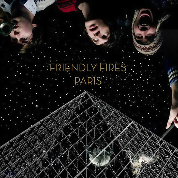
Stars: This image is from Nasa.com. I was inspired by Little Boots' album cover to include this. These images of space are frequently used in 'indie' covers:- for example Friendly Fires and Empire of the Sun. To me, it illustrates to the consumer how their music will act as a means of escapism. Alternative music, to me, tries to be different and unique deliberately; the way space is seen as being so different to Earth is maybe a link into their own 'difference'.

Legs with Rollerskates:
- The rollerskates are a symbol of fun, youth and the youth's need to speed through life. The target audience of Alternative music like ours would be a young group of people who may stick to the motto: Live Fast, Die Young.
- The rollerskates also link into the idea of speed and thus the title of the album: Look At That Rabbit Go!
- The positioning of the legs makes the girl they belong to look as if she is sitting on a cloud and dangling her legs happily. This evokes a happy image of her and thus links to the band's name Happiness. (I say that she looks like she's on a cloud only because of the rest of the design being of the sky).
'Rabbit' from the video standing up: Used for synergy and continuity.
The fact that the images are starry: Reinforces the other-worldly-ness. It gives continuity to the design and 'pulls' it all together.
Polaroid picture with 'Rabbit' from the video sitting down: Polaroid photographs are linked to the youth and their current obsession with speedy results, creativity and vintage goods. Polaroids are 'cool' within the young Alternative consumer group. To reinforce this, you would not stereotype a RnB consumer to use a Polaroid camera!
FORMAT:
Sans-serif font: Conotes moderninity. Would appeal to the young target audience because of this. For instance, the target audience would not be attracted if the font was Times New Roman!
The fact that the font is starry: Reinforces the other-worldly-ness. It gives continuity to the design and 'pulls' it all together. Would appeal to the young target audience.
The sticker: Inspired by other digipaks I have seen. I have given it a colour that I have already used in the imagery on my digipak, so that it 'pulls' it all together. I have made it round, mainly because other stickers are generally this shape on digipaks, but also because for aesthetic appeal. I have tilted the text on the sticker so as to give it an appearance of being casually stuck on. This casual placement reflects the casual attitude of both the band and the listeners. Casual and careless is 'cool' to youth.
The sticker giving information about bonuses: Gives the consumer a feeling that they should buy the product as they will be a part of an elite minority who has the chance to see 'Limited Edition' footage.
The list of songs: No title to show what the list is of. We assume the consumer knows from experience.
The list of bonuses: A titles is given as bonus formats are not usually given. The word 'Exclusive' in 'Exclusive Interview' attracts the consumer as they feel as if they are part of an elite minority who has the chance to see 'Exclusive' footage.
The small print: a universal feature of a digipak. Implies professionalism.
The barcode: a universal feature of a digipak. Implies professionalism.

No comments:
Post a Comment