Search My Blog

Monday, 22 February 2010

Analysing a magazine advertisement for a band [Marina &The Diamonds]

CD COVER [LEFT]
MAGAZINE ADVERTISEMENT [LEFT]

SYNERGY AND INTERTEXTUALITY:
The same imagery etc is used for the digipak as in the advertisement. This is to create an identity for the band. It also ensure that the consumer knows what to look for in, say, HMV, when they want to purchase the product.


ANALYSIS

Basic Design
Triangular composition
No symmetry and no appararent reason for this

Spatiality
Filled spaced with graphic and copy elements
No use of white space, thus a messy, unclean look is given

Symbols
Open mouth = sexuality, sexual connotations
Jewel coloured vintage fabric = reflects the bands' name "Diamonds" and the albums' name "Jewels".

People
Facial expression = sexy (open mouth)
Position = laying down (implies sex)
Age = 20s (target audience)
Hair colour and style = brown (sultry) = loose (carefree)
Other people? = No, she is the only one (Implies she is main singer)

Happening in the Background
Head is superimposd onto vintage fabric
Sharp back and foreground
Vintage fabric = links to today's youth and their obsession with vintage objects.


Language
Simple Information
Short and Snappy
Different size fonts
- What it includes, when it is released, name of debut album and its release, how to purchase, formats available, quotes of reviews, website of band.

Fonts
Handwriting = carefree; implies lyrical notes; old fashiones which reflects 'The Family Jewels'
Sans-serif = Other side of youth (use of technology) (moderninity); smart and legible for information to be comprehendable.

Aesthetic Decision
Copy is arranged to follow the slope of Marina's photograph. The copy above her slants and the copy below her is horizontal - fitting around her face and body which lays central and horizontal in the composition.

Relationship between pictorial elements and wriiten material
The Family Jewels = Links into the colour scheme.

Attitudes
Economical and Social attitudes are perhaps portrayed.
Economical ===> An image of weath (The family Jewels and imagery of vintage fabric and old handwriting all evoke the idea of inheritance from a written will).
Social ====> An image of sex via her position and open mouth [and sex sells!]. The Family Jewels is also the youth's expression for testicles.

__________________________________________________________________

How will I take this into account when I design my advert and digipak?

I will:
* Ask the audience about whether they like it when there is synergy in the designs
* Ask the audience about whether they like the jewely colours
* Ask the audience about whether they like that you can see the 'face' of the band.
* Ask the audience about whether they like complex (Marina & The Diamonds') or simple (Field Music's) designs.
* Take all the aspects that I have analysed into consideration when I design mine.

Researching Features of a Music Magazine Advert

Our second ancillary task is to design a magazine advert for our band, and thus their digipak.
I have begun to research into some bands' magazine adverts and have picked out features that they include in order to publicise their digipak.


These are all possible information that can be included in magazine adverts for music:-


Name of Band/Artist
Merchandise that is available
Release Date
Content of product
Bonus material
Title of the album
Title of hit singles
A website link
Reviews
Record Label
Outlets where it can be purchased
Tour dates
In what formats it is available


I think I should pick a few of these - but not all, otherwise it would result in an information overload.

Analysis of My Own Digipak Design

EXPLANATION OF MY DIGIPAK DESIGN:-


IMAGERY:


Colour Scheme: Jewel colours give the appearance of quality and make the consumer want to look closer and admire the design. I chose to keep the image of the starry sky (and nebula) blue as it reminded me of The Empire of the Sun's album cover. The orange of the nebula creates interest.

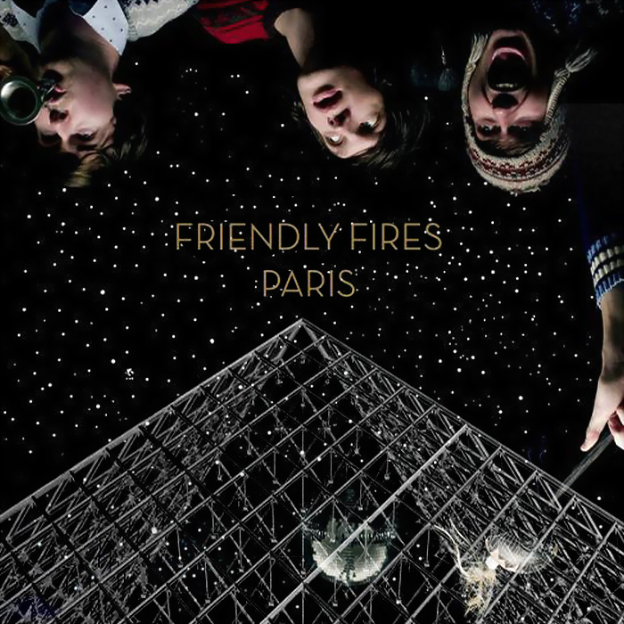
Stars: This image is from Nasa.com. I was inspired by Little Boots' album cover to include this. These images of space are frequently used in 'indie' covers:- for example Friendly Fires and Empire of the Sun. To me, it illustrates to the consumer how their music will act as a means of escapism. Alternative music, to me, tries to be different and unique deliberately; the way space is seen as being so different to Earth is maybe a link into their own 'difference'.


Legs with Rollerskates:

  • The rollerskates are a symbol of fun, youth and the youth's need to speed through life. The target audience of Alternative music like ours would be a young group of people who may stick to the motto: Live Fast, Die Young.
  • The rollerskates also link into the idea of speed and thus the title of the album: Look At That Rabbit Go!
  • The positioning of the legs makes the girl they belong to look as if she is sitting on a cloud and dangling her legs happily. This evokes a happy image of her and thus links to the band's name Happiness. (I say that she looks like she's on a cloud only because of the rest of the design being of the sky).
'Rabbit' from the video sitting down: Used for synergy and continuity.


'Rabbit' from the video standing up: Used for synergy and continuity.


The fact that the images are starry: Reinforces the other-worldly-ness. It gives continuity to the design and 'pulls' it all together.


Polaroid picture with 'Rabbit' from the video sitting down: Polaroid photographs are linked to the youth and their current obsession with speedy results, creativity and vintage goods. Polaroids are 'cool' within the young Alternative consumer group. To reinforce this, you would not stereotype a RnB consumer to use a Polaroid camera!


FORMAT:

Sans-serif font: Conotes moderninity. Would appeal to the young target audience because of this. For instance, the target audience would not be attracted if the font was Times New Roman!

The fact that the font is starry: Reinforces the other-worldly-ness. It gives continuity to the design and 'pulls' it all together. Would appeal to the young target audience.

The sticker: Inspired by other digipaks I have seen. I have given it a colour that I have already used in the imagery on my digipak, so that it 'pulls' it all together. I have made it round, mainly because other stickers are generally this shape on digipaks, but also because for aesthetic appeal. I have tilted the text on the sticker so as to give it an appearance of being casually stuck on. This casual placement reflects the casual attitude of both the band and the listeners. Casual and careless is 'cool' to youth.

The sticker giving information about bonuses: Gives the consumer a feeling that they should buy the product as they will be a part of an elite minority who has the chance to see 'Limited Edition' footage.


The list of songs: No title to show what the list is of. We assume the consumer knows from experience.

The list of bonuses: A titles is given as bonus formats are not usually given. The word 'Exclusive' in 'Exclusive Interview' attracts the consumer as they feel as if they are part of an elite minority who has the chance to see 'Exclusive' footage.


The small print: a universal feature of a digipak. Implies professionalism.


The barcode: a universal feature of a digipak. Implies professionalism.

Digipak - Progress

I've been using Adobe Photoshop to edit different components together to construct my final digipak.
*a CD
*the small print from The Futurehead's digipak
*a polaroid from Google.com/Images
*a picture of rollerskates and legs from Flickr.com
*a photo of the protagonist from our photo shoot
*stars from NASA.com


Inspiration: Little Boots' album; Friendly Fires' album; Empire of the Sun's album.


Inspiration for Final Digipak. [[Friendly Fires]]


Inspiration for Final Digipak. [[Empire of the Sun - Walking on a Dream]]

Inspiration for Final Digipak. [[Little Boots - Hands]]

DIGIPAK OF 'LITTLE BOOTS' - AN ALTERNATIVE SINGER

ELEMENTS THAT I LIKE:
The use of the starry sky
The use of an image the main girl
The simplicity of the information given (just the Singer's name and the title of teh album)


The use of the stars, as well as the triangle is quite common in Alternative bands' album covers.

Maybe I could incorporate these so as to conform to the genre.


I don't wish to include numbers on my song list, as it is quite old fashioned in my opinion, and I want to portray moderninity.

I like the composition here. I would like to have an image on the right and the song list on the left.


I wish to have the same theme of background running through my digipak. Here, you can see that the pastel coloured sky is used for each section of the 'pak.

Second Try at Designing the Album Cover - JUXTAPOSITION


For this try-out I have experimented with an image that juxtaposes the word 'Happiness'.

I have used sans-serif text to appeal to the modern target audience.

Hoever, it seems quite lacking - Compared to other Alternative covers which are generally quite messy and don't use much white space.

I need my composition to be a lot more crammed (if that's the word?) so to appeal to the target audience. The target audience would be a youth group who would favour carelessness and casualness over neat and tidy.

However, I will keep the modern sans-serif text in my final design.

First Try at Designing the Album Cover

Researching for Inspiring Images [for album cover]

I began my research by scanning through flickr.com and google.com/images by entering keywords such as: CRYING; ROLLER SKATES; DURACELL BUNNY; SAD CHILD; STARS; VAGABOND; HOMELESS WITH SIGN; PAINT POTS; MONEY; SMILING.

I chose to search for words that either: -

implied happiness, like the bands' name.

or

contrasted hapiness.

CRYING; = JUXTAPOSITION

ROLLER SKATES; = CONFORMS

DURACELL BUNNY; = LINKS IN TO IDEA OF 'LOOK AT THAT RABBIT GO'

SAD CHILD; = JUXTAPOSITION

STARS; = CONFORMS AND WAS INSPIRED BY 'LITTLE BOOTS' ALBUM COVER

VAGABOND; = JUXTAPOSITION

HOMELESS WITH SIGN; = JUXTAPOSITION

PAINT POTS; = CONFORMS

MONEY; = CONFORMS

SMILING. = CONFORMS